
Count me among the believers that the present era of growing transparency and access to data is one of the most transformative trends of our time. But as always, the trend may not be as positive as it might seem.
Don’t get me wrong, more access to data is better than less access to data. But what matters most is what we do with the data. With more and more data available, increasingly one of the things we are doing is data visualization, just to make sense of the numbers.
Visualizations are incredibly useful because for most humans comprehending the meaning of large sets of numbers is quite difficult, and comprehension based on data is a key tool for change. But because people have a hard time comprehending data and an easier time comprehending visualizations, it becomes incredibly important that we use data visualization well.
Are you enjoying this article? Read more like this, plus SSIR's full archive of content, when you subscribe.
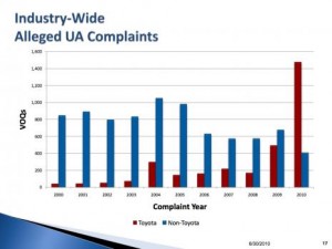
Let me give you a few examples. First, consider the “runaway” Toyota stories that dominated the news this spring. Data visualizations, like this one (Figure 1), appeared in many media reports offering what seems to be compelling evidence that indeed something was wrong with Toyotas.
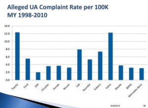
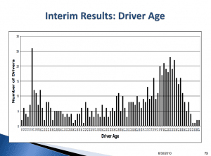
But now take a look at Figures 2 and 3. Figure 2 shows complaints of sudden acceleration per 100,000 vehicles on the road. While Toyota is still well above the norm, the brand with the highest percentage of complaints is in fact Volvo—not a brand that many people seemed to be concerned about in terms of safety. But Figure 3 is even more telling. It shows that the vast majority of complaints of sudden acceleration were made by either new drivers or elderly drivers, the groups most likely to inadvertently press the wrong pedal. Suddenly there is good reason to question whether there was something wrong with Toyotas after all. The on-going NHTSA investigation bears this out. The data visualization accompanying the Toyota news coverage led huge numbers of people to a false conclusion.
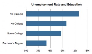
Here’s another example that is at the top of the agenda right now: unemployment in the US. You may have seen this data visualization in various places recently (Figure 4) illustrating the huge gap between the unemployment rate of college graduates and non-college graduates in the economy today. College grads unemployment rate is less than half that of the national average. That seems to reinforce the importance of getting young people, especially underrepresented minorities graduating from college.
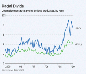
And yet another visualization (Figure 5) of the underlying data shows a very different picture: there is a huge gap between the unemployment rate of white and black college grads with black college grads unemployment rate not much different than the national average. Furthermore, the unemployment rate for people under 29 is over 15 percent, or 50 percent higher than the national average. Combine that statistic with the huge rise in college costs and college debt and you have a very different picture of the problem and what the right solutions might be.
As these examples indicate, data visualizations are powerful and potentially dangerous because they tend to make people believe that they understand the situation far more than if presented with a bank of numbers. For some reason, people are more cautious with numbers than they are with visualizations of numbers, rapidly forming strong opinions based on charts. Facts are stubborn things, as John Adams said, but they are not as stubborn as opinions. If we misuse the power of data access and data visualization to mislead, whether inadvertently or not, the transformation of our society of data and data visualization will not be positive.
For nonprofits working on social change, data and data visualization are going to be key levers. But to use those levers effectively—to drive actual change not just convince people we’re right—we need people at nonprofits and foundations who understand data and data visualization.
People with good data visualization skills are rare and precious commodities. To quote from Spiderman, “With great power comes great responsibility.” Let’s make sure some of those with great power are exercising great responsibility in the social sector.
Support SSIR’s coverage of cross-sector solutions to global challenges.
Help us further the reach of innovative ideas. Donate today.
Read more stories by Timothy Ogden.