
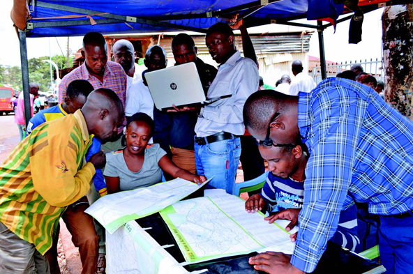
 Residents in Nairobi, Kenya, gather data to contribute to local mapping initiatives and the OpenStreetMap and Mapbox platforms. (Photo courtesy of Mapbox)
One of the most important maps in human history was not created by a professional cartographer or navigator. It was made in 1854 by a London physician named John Snow. He suspected that the cholera outbreak in London’s Soho neighborhood, which killed 616 people, was spread through water, not air. At that time, the dominant—and incorrect—miasma theory of disease held that germs spread through bad odors, and some doctors even believed that the smell of certain foods could cause obesity. Many people thought they could ward off disease with perfume.
Snow wanted a way to disprove the centuries-old miasma theory and confirm his hypothesis that cholera spread through water. So he mapped the location of each water pump in Soho and used dots to represent each case of cholera. It turned out that most of the dots clustered around a water pump on Broad Street. The parish’s Board of Guardians removed the pump’s handle the day after Snow presented his findings to them, and his simple map helped launch the study of epidemiology.
“When they work, maps can tell a story in a language that everyone can understand,” says Steve Chilton, chair of the United Kingdom-based Society of Cartographers. “Snow’s map had such a huge impact because it was simply a great data visualization.”
Snow’s map also was proof that one doesn’t need to be a trained cartographer to use geographical data to solve social problems. Nowadays, geographic mapping platforms like Mapbox, OpenStreetMap, Mapillary, and Visualizing Cities share this belief and aim to compete with the ubiquitous Google Maps, offering alternative views of the world—both literally and figuratively. These scrappier mapping initiatives work with much smaller budgets than Google Maps—OpenStreetMap’s operating budget is only about $100,000 per year. But their data and software are generally free to use and adapt (“open source”)—or at least relatively cheap, in cases such as Mapillary’s $250 per month subscription model—with the understanding that users, in turn, will be contributing (“crowdsourcing”) data to build up these platforms.
Google Maps, in contrast, allows anyone to use its platform or integrate it into their own—charging in heavy-use and commercial cases—but doesn’t share the geographic data and programming code behind it. (Its moderated crowdsourcing arm, Map Maker, will end in March after cases of vandalism.) Google’s official objective is “to organize the world’s information and make it universally accessible and useful.” But Google is also motivated by the desire to privately collect information useful in developing its own products, such as drones or self-driving cars. The company has been criticized for leaving entire townships in South Africa off Google Maps due to the low priority it puts on the African continent, where it has seen less commercial potential. All that makes alternative mapping platforms attractive for many passionate citizen cartographers—and for competing companies like Foursquare, which defected from Google Maps and is now powered by Mapbox, using data from OpenStreetMap.
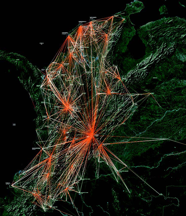 A winning entry in Visualizing Cities’ mapping competition shows the migration patterns of people displaced by conflict in Colombia. (Image By Center for Spatial Research, Columbia University / Courtesy of Vislualizing cities)
These alternative platforms also appeal to many people and groups interested in improving their communities’ well-being. In 2016, San Francisco-based Mapbox—which offers most users free access to its data and code while charging some large and commercial users for additional use and services—announced a mentorship program that awards three cities resources and training in how to use mapping data to solve urban challenges, such as hazardous street conditions during East Coast blizzards. Mapbox will be working with the first awardee, Melbourne, to visualize traffic data that will help with infrastructure planning. Mapbox also supports NGO mapping efforts—for example, a project in Tanzania to combat female genital mutilation by providing maps to safe houses where girls can hide until the circumcision season is over.
Another application built on the Mapbox platform is FarmLogs, farm management software that helps farmers map data on their equipment, workforce, seasonal yield, and other inputs on top of the street, terrain, and satellite data provided by Mapbox and other data provided by third parties (such as soil statistics from the US government). According to FarmLogs, which is largely subscription-based, one in three US farms, totaling more than 65 million acres, use the tool. “Mapbox is a canvas for all location data, and agriculture is becoming more and more of a data business,” says Mapbox spokesperson Jennifer Yu.
Like Mapbox, Sweden-based Mapillary crowdsources content, such as its street view photos, focusing on places like Cuba where Google has yet to send its camera-equipped cars or drones. Search for “Havana, Cuba” on Google Maps and you’d be lucky to find a bus stop or two in the entire city of two million residents. Search for “Havana, Cuba” on OpenStreetMap and you’ll find the locations of not only bus stations but vegetable stalls, gas stations, and scores of other sites around the city. That’s largely because of a joint venture between Mapillary and OpenStreetMap in which a dozen Havana residents took to the streets last September and snapped more than 65,000 street-level photos across 200 square miles of the capital.
To protect privacy, Mapillary’s team of developers blurs out faces and sensitive information in the photos. And due to the Cuban government’s unclear stance on crowdsourcing local data, Mapillary’s OpenStreetMap contributors attempt to collect their data under the radar, avoiding restricted areas. Despite these challenges, crowdsourced mapping platforms tend to run into fewer problems with accuracy and vandalism than text-focused ones (like Wikipedia), according to Mapillary CEO Jan Erik Solem. “With Mapillary’s data, there is not really an argument or conflict,” he says. “Either a photo contains a piece of information or it doesn’t. The photo is the evidence.”
But both open source and proprietary mapping data still can be used for nefarious purposes. In 2015, a neo-Nazi group used Google Maps to create a visualization of all the refugee camps in Europe. (Google took down the map.) And even when the intent isn’t hostile, it’s possible to create maps that misidentify or misrepresent the data. As Mark Graham, professor of Internet geography at the University of Oxford, points out, “Every map brings its author’s biases to the table. And there will never be such a thing as an unbiased map.” (Think of the world maps popular with Australians that show the south on top.)
Having worked in cartography for more than four decades, including as an active member of the OpenStreetMap community, Steve Chilton from the Society of Cartographers worries about people visualizing and contributing data without thinking about the ramifications. “I would appreciate it if people wouldn’t produce a map just because they have access to particular data, and perhaps understand the mantra that was drummed into me in my training, that ‘every map should have a point,’” he says. “All maps should ideally have a purpose, which should influence every element of the map and the map layout.”
“In many cases, the raw, original data is disconnected from the visual output,” says Sebastian Meier, chair of the Potsdam-based platform Visualizing Cities. “Often, many layers of algorithmic processing sit in between data collection and visualization, making it hard for laymen and -women to understand how the visualization is created.” The Visualizing Cities initiative aims to help correct that problem, working with mapping company Here to fund, collect, and share a wide range of private and public mapping projects and running a competition to raise awareness about the many different ways that maps can convey information to communities. The winning data visualization entries for Visualizing Cities’ first competition, in 2016, included maps of migration patterns of people displaced by conflict in Colombia (submitted by the Center for Spatial Research at Columbia University) and the locations of flooded roads in Chennai on a mobile-friendly interface (submitted by OpenStreetMap India and Mapbox).
To its credit, Google is also lending its platform to social initiatives. For example, it is working with India’s Ministry of Urban Development to help address the public sanitation crisis by creating a maps tool in both English and Hindi that allows users to search for the locations of public toilets. It also has launched a successor to its soon-ending moderated Map Maker program called Local Guides, a membership-based system that rewards people who submit local knowledge to Google Maps with access to Google products and services. “We show the best data we’re able to from thousands of authoritative sources including public and commercial mapping data, imagery from every level, and user contributions,” says Elizabeth Davidoff, communications manager at Google Maps. But open source enthusiasts are skeptical, given Google’s refusal to freely share its data. Google is “very autocentric, in that it shows very little data once you get off the road system,” Chilton says. For people and programs that want to chart their own paths, other mapping initiatives are leading the way.
Support SSIR’s coverage of cross-sector solutions to global challenges.
Help us further the reach of innovative ideas. Donate today.
Read more stories by Noël Duan.