
How can we use data to both humanize our work and demonstrate our robust social impact?
How can we use data to tell a story without bogging down our audience with numbers and statistics?
How can we inspire using data?
These are just a few of the nearly 200 questions people asked on a survey before my talk at SSIR’s Data on Purpose conference. I thought they represented a fascinating mix of some of the most thoughtful and prevalent questions among conference attendees and, I suspected, among social innovators everywhere.
Are you enjoying this article? Read more like this, plus SSIR's full archive of content, when you subscribe.
At DataKind, we use data science and algorithms in the service of humanity, and we believe that communicating about our work using data for social impact is just as important as the work itself. There’s nothing worse than findings gathering dust in an unread report.
We also believe our projects should always start with a question. It’s clear from the questions above and others that the art of data storytelling needs some demystifying. But rather than answering each question individually, I’d like to pose a broader question that can help us get at some of the essentials: What do great data storytellers do differently and what can we learn from them?
1. They answer the most important question: So what?
Knowing how to compel your audience with data is more of an art than a science. Most people still have negative associations with numbers and statistics—unpleasant memories of boring math classes, intimidating technical concepts, or dry accounting. That’s a shame, because the message behind the numbers can be so enriching and enlightening.
The solution? Help your audience understand the “so what,” not the numbers. Ask: Why should someone care about your findings? How does this information impact them? My strong opinion is that most people actually don’t want to look at data. They need to trust that your methods are sound and that you’re reasoning from data, but ultimately they just want to know what it all means for them and what they should do next.
A great example of going straight to the “so what” is this beautiful, interactive visualization by Periscopic about gun deaths. It uses data sparingly but still evokes a very clear anti-gun message.
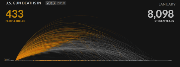 Periscopic’s data visualization on gun deaths in the United States. (Image courtesy of Periscopic)
There’s certainly data involved in this visualization, and the statistical modeling that drives its estimate of the age of gun victims is quite clever and advanced. But there’s really only one statistic that matters on display: number of stolen years.
In fact, I’d argue that the precise number barely matters, in the sense that it isn’t mathematically important. At the end of the animation, the viewer might not even remember what the total number of years is—but they’ll remember that it was more than zero. Watching those tiny points on the graph—each representing a person—drop, struck dead, left me with a very powerful feeling of sadness. Periscopic is making a point, and its data-driven visualization makes you feel it in a way that doesn’t bog you down with stats.
2. They inspire us to ask more questions.
The best data visualization helps people investigate a topic further, instead of drawing a conclusion for them or persuading them to believe something new.
For example, the nonprofit DC Action for Children was interested in leveraging publicly available data from government agencies and the US Census, as well as DC Action for Children's own databases, to help policymakers, parents, and community members understand the conditions influencing child well-being in Washington, DC. We helped create a tool that could bring together data in a multitude of forms, and present it in a way that allowed people to delve into the topic themselves and uncover surprising truths, such as the fact that one out of every three kids in DC lives in a neighborhood without a grocery store.
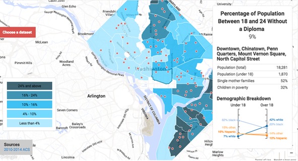 DC Action for Children’s DataTools 2.0 allows users to create different data views of child well-being in Washington, D.C.
DC Action for Children uses a “tiered information” approach that could work well for other organizations:
- On its website, there is an executive summary explaining key findings from the data for policymakers—not terribly data heavy, simply nodding to a few statistics to support its conclusions.
- If you’re really interested in exploring outside of DC Action for Children’s initiatives, you can go one step further and navigate around the map, add and remove layers, and otherwise create different data views yourself.
- If you’re really invested in the data, you can go one last step further and actually download all of the data, carefully cleaned and curated, so you can do analysis yourself.
3. They use rigorous analysis instead of just putting numbers on a page.
Data visualization isn’t an end goal; it’s a process. It’s often the final step in a long manufacturing chain, along which we poke, prod, and mold data to create that pretty graph.
Years ago, the New York City Department of Parks & Recreation (NYC Parks) approached us—armed with data about every single tree in the city, including when it was planted and how it was pruned—and wanted to know: Does pruning trees in one year reduce the number of hazardous tree conditions in the following year? This is one of the first things our volunteer data scientists came up with:
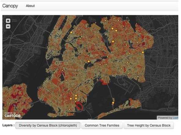 Visualization of NYC Parks’ Department data showing tree density in New York City.
This is a visualization of tree density New York—and it was met with oohs and aahs. It was interactive! You could see where different types of trees lived! It was engaging! But another finding that came out of this work arguably had a greater impact. Brian D’Alessandro, one of our volunteer data scientists, used statistical modeling to help NYC Parks calculate a number: 22 percent. It turns out that if you prune trees in New York, there are 22 percent fewer emergencies on those blocks than on the blocks where you didn’t prune. This number is helping the city become more effective by understanding how to best allocate its resources, and now other urban forestry programs are asking New York how they can do the same thing. There was no sexy visualization, no interactivity—just a rigorous statistical model of the world that’s shaping how cities protect their citizens.
And this is exactly where a certain tension around data visualization comes in. When people talk about “using data,” they’re often using the same terms to refer to two very different but related streams of work—what we call “data for humans” vs. “data for machines.” The NYC Parks map above, for example, is squarely “data for humans.” We assume this beautiful portrayal of the data will cause someone at NYC Parks to “see something” and then do something new—and it may. But the 22 percent number Brian computed—using techniques of probability and statistics to rigorously learn more about the world than we knew before—produced not just data, but a new finding, and ultimately a justification for NYC Parks’ programs. In the end, data without analysis is essentially just rhetoric.
For more on using data visualization for social impact, listen to my Data on Purpose talk or check out the recap of my presentation. For more inspiration from great data storytellers, check out the work of Giorgia Lupi or Jer Thorpe. Just as good data storytelling leads to more questions, may this blog too lead to much more discussion!
Support SSIR’s coverage of cross-sector solutions to global challenges.
Help us further the reach of innovative ideas. Donate today.
Read more stories by Jake Porway.