
 (Illustration by iStock/filo)
Through rigorous, data-based analysis, researchers and analysts can add to our understanding of societal shortcomings and point toward evidence-based solutions. But carelessly collecting and communicating data can lead to analyses and visualizations that have an outsized capacity to mislead, misrepresent, and harm communities already experiencing inequity and discrimination.
To unlock the full potential of data, researchers and analysts must consider and apply equity at every step of the research process. Ensuring responsible data collection, representing the communities surveyed accurately, and incorporating community input whenever possible will lead to more equitable data analyses and visualizations. Although there is no one-size-fits-all approach to working with data, for researchers to truly do no harm, they must build their work on a foundation of empathy.
In our recent report, Do No Harm Guide: Applying Equity Awareness in Data Visualization, we focus on how data practitioners can approach their work through a lens of diversity, equity, and inclusion. To create this report, we conducted more than a dozen interviews with nearly 20 people who work with data to hear how they approach inclusivity. In those interviews, we heard time and time again that demonstrating empathy for the people and communities you are focusing on and communicating with should be the guiding light for those working with data. Journalist Kim Bui succinctly captured how researchers and analysts can apply empathy, saying: “If I were one of the data points on this visualization, would I feel offended?”
We do not want to prescribe what to do or not do, but rather encourage thoughtfulness in how analysts work with and present their data. As we consider the use of words, colors, icons, and more in our data visualizations, asking whether we would be offended makes for a good checkpoint.
Here, we detail three ways you can make your data analysis and communication more equitable and inclusive.
Use Inclusive, People-First Language
Titles, text, and labels are among the first things readers scan when encountering a chart and present an important opportunity to set a foundation of equity and inclusion. Researchers and practitioners should name forces of oppression such as racism directly in the chart title and subtitles.
Additionally, we should strive to use people-first language and reference people’s experiences, not language that dehumanizes or references skin color and static descriptions. For example, write “Black People,” “people with disabilities,” and “incarcerated people” rather than “Black,” “disabled,” or “inmates.”
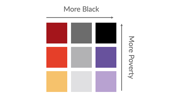
Using non-inclusive or dehumanizing language in data visualizations can lead to othering groups of people or implying one group is the “norm.” A June 2020 interactive Tableau dashboard that showed the relationship between race and poverty in every county of the US gives one example of how non-inclusive language can be harmful. The original data labels—“More Black” and “More Poverty”—are not inclusive of different groups and can imply these groups are lesser.
Here, considering empathy could have helped the data practitioners be more inclusive. A more inclusive way to label the legend might have been “Larger Proportion of the Black Population” and “Larger Proportion of People in Poverty” (the author of the visualization later changed “More Black” to “Larger Black Population,” and we are grateful the author provided us with permission to include this example here). Although these labels are longer and might not fit as nicely, they are more inclusive and respectful of people being represented in the data. When creating a visualization, think about how you would like to be described or represented with words.
Order Data Purposefully
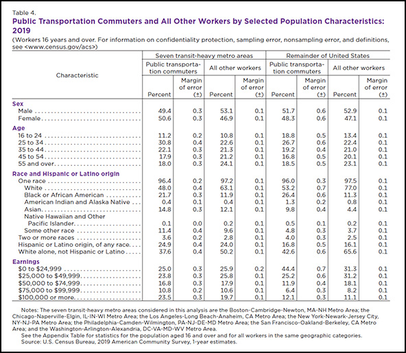
Often, researchers and analysts give little thought to how they present estimates in charts, graphs, tables, and diagrams. Many of the large demographic surveys conducted in the US order race starting with “white” and “Black” as the first two options. Similarly, “male” and “female” are far too often the only options provided to answer questions about gender. The groups that data researchers choose to show in the first row of a table or the first bar in a graph can affect how readers perceive their relationship. Always starting with “white” or “men”—as in this example table from an April 2021 report from the US Census Bureau—can make these groups appear as the default and give them outsized importance.
Instead of using the ordering of groups provided in the data, consider some alternative presentation options:
- Does your study focus on a particular community? If it does, present that group first.
- Is there a particular argument or story you are trying to tell? If so, order your results to reflect that argument.
- Can the groups be ordered by their quantitative relationship, either in ascending or descending magnitude? Can the groups be sorted alphabetically, by population size, or sample size (weighted or unweighted)? Don’t let the underlying data make these decisions for you. Instead, make conscious, purposeful choices to present your data through an inclusive, equitable lens.
Choose Colors With Care
Good color palettes for data visualization should, at minimum, meet basic accessibility guidelines and offer sufficient contrast for readers with vision difficulties. Going beyond accessibility, color choices should also avoid reinforcing gender or racial stereotypes, such as baby pink and baby blue to represent women and men or colors associated with skin tones or racial stereotypes (e.g., black to represent Black people or yellow to represent Asian people).
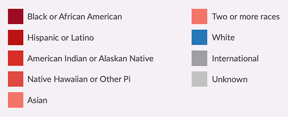
The color palette below originally appeared in a June 2020 version of the Massachusetts Institute of Technology Office of the Provost’s “Diversity Dashboard,” which enabled users to explore the demographic characteristics of the school’s students, faculty, and staff. The dashboard represented six racial groups with shades of red, the “international” and “unknown” groups with two shades of gray, and only the “white” group with blue.
This color palette presents at least two problems. First, by using shades of red to represent the six groups of students of color, the palette creates a visual divide that pits students of color against white students. Second, graduated color palettes generally show greater or higher values in darker colors and smaller or lower values in lighter colors. By using a graduated color palette, the dashboard appears to suggest that “Black or African American” students are somehow “more” or “higher” than students who identify as “two or more races.”
Together, these two issues create an effect where students who identify as “white” are moved to the foreground and highlighted, as if they are the most important group and the norm to which all other groups should be compared. Instead, a color palette with nine distinct hues or a different data visualization type altogether would do a better job of applying a racially equitable lens.
Centering Empathy
Here and in our longer report, we have laid out many recommendations and guidelines that people and organizations can consider to take a more equitable and inclusive view of data and data visualizations. We don’t view these topic areas or even the suggested alternatives as ironclad rules. Instead, we see these principles as a starting point for people to think more carefully and critically about how to embrace inclusion throughout the pipeline of data creation, analysis, and communication.
In your own reports, blog posts, dashboards, and visualizations, consider how you would want to be represented. Do your color choices communicate equity? Are your icons respectful and diverse? Approaching the process of data analysis and communication through an equitable and inclusive lens will ultimately create a better society for everyone.
Read more stories by Alice Feng & Jonathan Schwabish.