
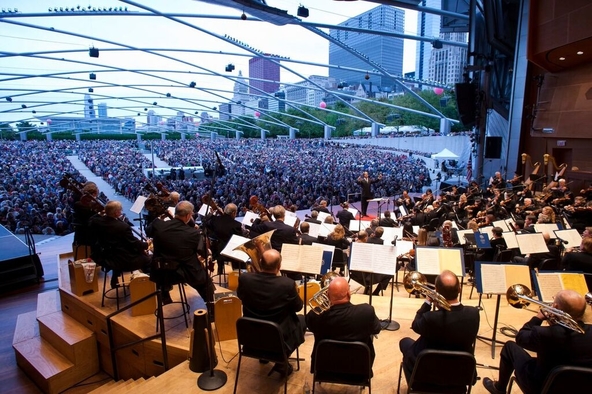
 The Chicago Symphony Orchestra performs at a free concert in Millennium Park's Pritzker Pavilion on September 19, 2010 to mark the start of music director Riccardo Muti's tenure. (Photograph by Todd Rosenberg)
On January 20, 2010, an audience of 200 business leaders, mayors, members of the US Congress, directors of large urban arts commissions, and media gathered at the National Press Club in Washington, D.C.
They came to mark the launch of the National Arts Index (NAI), a new research and policy initiative that promised to do for the arts what the Dow Jones Industrial Average did for stock ownership. It would gather large volumes of data on the arts sector and compress them into a single measure. If it worked as planned, it would provide a nonpartisan, factual basis by which policy makers, arts leaders, and philanthropists could deliberate about the arts sector in all its complexity. And it would also spark dialogue about the arts that anyone—not just industry experts—could engage in.
The country was only just emerging from the Great Recession, with policy makers still fretting over high unemployment, a stagnant economy, and an unresponsive stock market. Arts funding was tanking and attendance rates dipping. Would arts and policy leaders be ready for more bad news? Would there be rays of light amid the dismal national economic picture? Was the field ready for a transparent measurement of arts engagement and vitality? The arts research lens had never been widened to this degree of aperture.
The speakers who took the podium that morning were diverse but shared a conviction that arts and culture were fundamental to building a healthier society and therefore deserved a sounder footing in policy debate. US Representative Louise Slaughter (D-N.Y.), cochair of the Congressional Arts Caucus, praised the Index’s usefulness to government policy makers in tracking the health of the arts and efficacy of cultural policies. William Ivey, former chairman of the National Endowment for the Arts (NEA), and Arthur C. Brooks, president of the libertarian American Enterprise Institute, signaled the common ground that the NAI could create in an age of partisanship. From opposite sides of the political spectrum, both praised the NAI for advancing evidence, numbers, and facts over mere advocacy and sensational anecdotes to offer practical insights about how to boost the sector.
Eventually, six National Arts Index reports were produced between 2010 and 2016 before the project ended. Herein we tell the story of its creation, development, and impact, and offer up lessons from our experience working on the NAI, in hopes of helping others who pursue their own policy indexes in other fields.
The Policy Index as Tool
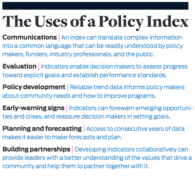
A “policy index” offers a way to address the conundrum of increasing demands for data, when the size and complexity of data can defy understanding. We define a policy index as a curated data set, compiled as one or more concentrated measures, regularly presented over time, and designed to inform and influence public discourse and policy. A policy index provides a common currency of language, a way to talk about a sector that can be understood and accepted by public and private sector leaders as well as by ordinary citizens.
We are surrounded by indexes. Increasing volumes of data necessitate the development of such tools to make sense of it all. When we hear that the “Dow” or the Consumer Price Index (CPI) is rising or falling, we understand that these are broad measures of stock market performance and price level changes. They work by compressing large quantities of data into one number that is calculated the same way daily (Dow) or monthly (CPI), making it easy to compare between time periods.
The quest for more arts data has a venerable history. In 1967—three years before his blockbuster book, Future Shock—Alvin Toffler mused about a data-driven arts policy system. He envisioned a “cultural data system” to increase public understanding of the arts—one that would incorporate the broad range of industries, processes, and networks that make up the world of the arts, to be implemented as a tool to inform policy makers, funders, and administrators.1
The federal government had at that time a relatively sparse set of arts-focused indicators, and this neglect continued. By the early and mid-2000s, the US government was absent from many global initiatives to examine measurement of cultural capacity fostered by the United Nations Educational, Scientific, and Cultural Organization (Unesco) and other transnational interest groups. As a private sector nonprofit dedicated to advancing the arts nationally, Americans for the Arts (AFTA) was, therefore, well positioned to develop and disseminate a national arts measurement system, and embraced it as part of its research and policy program. In 2004, nearly four unanswered decades after Toffler’s challenge, the idea for the National Arts Index was born.
Planning the Index
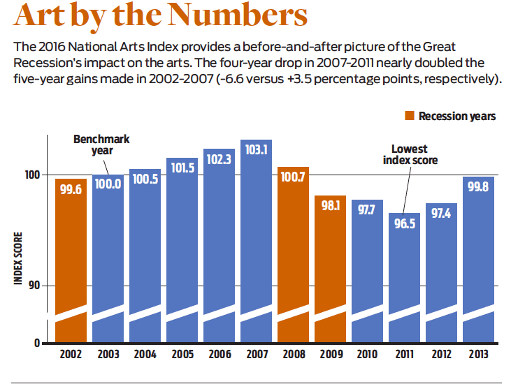
The NAI was a time-series measure of the vitality of arts and culture in the United States, based on 81 indicators, from 1998 to 2013. We published the sixth and final NAI report in 2016, which highlighted the years 2002 through 2013. The Index is a calculated score set to a baseline of 100.0 in 2003, measuring the health and vitality of the arts in the years leading up to, during, and since the Great Recession. Each point difference represented a 1 percent change in the overall score, making it easy to compare year-to-year performance.
The NAI differed from much contemporaneous arts policy research in that its goal was not mainly the promotion of specific policies, such as more funding to artists and arts organizations. Rather, it aspired to connect the arts to articulated public priorities (such as health, economy, and community engagement) and to stimulate public dialogue about the value of the arts to individuals, communities, and the nation. It would use an evidence-based approach, without the typical emotional catalysts for such conversations (“Funding cuts!”). It would enable not only arts leaders, but also political, business, and community leaders to talk in an informed manner about the arts, using similar information and terms about why change was occurring, where things were going in the future, and how the arts could stay vital.
To plan the NAI, we began by analyzing existing indexes that had achieved the stature we hoped the NAI could achieve—national in scope, produced annually, generating media attention, and used to inform policy and business decisions. Our aim was to better understand why and how these policy indexes were developed and maintained, and to learn from their managers. Our models included the Index of Leading Economic Indicators, the University of Michigan Consumer Sentiment Index, the Purchasing Managers’ Index, Kids Count, and the United Way State of Caring Index. Consequently, our informants were their authors at the Conference Board, the University of Michigan Survey Research Center, the Institute for Supply Management, the Annie E. Casey Foundation, United Way of America, and others. Their experience and accumulated wisdom, graciously shared, helped us establish principles and standards for acquiring, validating, and interpreting such data.
Leaning on this expertise, we planned three phases of design and implementation. First, we had to figure out how to model impact in the arts. We think of an impact model as stating how an index links the phenomena it measures to what is meaningful to people at a personal and consequential level. We sought to make vitality of the arts more easily understood and appreciated.
Second, we had to design the Index. In building a model to frame secondary data, we prioritized vitality—that is, how the arts regenerate and progress. We decided very early to use only secondary data, as the costs of gathering primary data over multiple years would exceed our resources. We believed the NAI should offer a parsimonious number that uses carefully selected data to provide an annual score. Concurrently, it should show the underlying data that led to that number. Curating the NAI called on us to be transparent, selective, and efficient with data. The design needed to highlight its subject, vitality in the arts, in a way that captured both its totality and its components.
Third, we had to create and manage the annual release of the Index. For impact, results from a sound measurement system should be presented to the public and influential stakeholders with an effective communications strategy—one that ensures the Index is an anxiously awaited finding every year.
Presenting the Numbers
We sought an approach that would help us organize multiple indicators into a compact presentation and would be accepted as a vitality model. The arts are clearly bigger than one organization, but we found that organization-level models of effectiveness held good analogues to our notion of vitality.
This led us to Robert Kaplan and David Norton’s Balanced Scorecard. This model emphasizes how four key dimensions of performance—financial success, internal processes, learning and growth, and customer satisfaction—contribute to a company’s overall effectiveness. They all are necessary, yet none alone is sufficient. This fit our thinking about our domain of the arts as a broad social system with multiple attributes of performance. We preserved the notion of four types of performance in balance and crafted an “Arts & Culture Balanced Scorecard” (ACBS). The four performance dimensions are financial flows, capacity, arts participation, and competitiveness.
Financial flows include private and public support to institutions, pay of individual artists, and revenues of arts businesses and nonprofits. All of these are payment for artistic services and provide fuel for capacity to produce arts activities and experiences for arts audiences. Basically, these are dollars flowing into the arts.
Capacity indicators measure stocks of institutions, capital, employment, and payroll levels in the arts and culture system. Capacity and infrastructure help transform financial flows into arts activities. In short, what capacity exists (besides revenues) to create and bring the arts to market.
Arts participation indicators measure actual consumption of those activities, which may be in the form of goods, services, participation, or experiences. These show the range of how people personally engage in the arts.
Competitiveness indicators compare the arts with other forces in a dynamic economy and society, using measures of market share and economic performance. Our attention to competitiveness was a distinctive feature of the NAI, highlighting our view of the arts in society as a broad system.
We defined and used the ACBS dimensions so we could associate each of the dozens of data series we found with only one dimension—making the dimensions mutually exclusive and collectively exhaustive. Our search produced different numbers of indicators to associate with each of those dimensions. So, we decided to calculate the annual NAI score with all indicators having equal weight, giving more credence to the data than to our theory-based model. Rather than giving a quarter of the weight to each ACBS dimension for a “theoretical balance,” the National Arts Index score was an equal-weighted annual average of all individual indicators measured, set to 2003 = 100.0.
The NAI is agnostic about the settings where arts and culture take place. Much arts research in the early 2000s focused on the nonprofit sector, sometimes only on institutions in traditional art forms. We believed that this view omitted important forces. The NAI deliberately widened the research lens to incorporate data on arts businesses, individual artists, and public and private arts engagement.
We found data series in many public and private sources, such as occupational data from the US Bureau of Labor Statistics; payroll from the US Census Bureau; and industry activity from trade groups for movies, Broadway, and other arts industries. Researchers in think tanks and universities had relevant data, as did commercial firms like Dun & Bradstreet and Nielsen Research. Ultimately, a big—and, at first, pleasant—surprise was the wide scope of data available. We initially expected to build an index using 30 indicators but ultimately identified 100 more. All of these needed to be evaluated.
To filter data sources, we established eight criteria that each indicator had to meet: (1) The indicator has at its core a meaningful measurement of arts and culture activity; (2) the data are national in scope; (3) they are produced annually by a reputable organization; (4) they are available beginning no later than 2003, our base year; and (5) measured proportionally, at a ratio level (not just on rankings or ratings). In addition, the data series is (6) statistically valid, even if based on samples. Finally, the data are (7) expected to be available for use in the Index in future years and (8) affordable within project budget constraints.
From 2005 to 2009, we designed, planned, and sought out indicator data; in mid-2009 we committed to the inaugural release in early 2010. Given our model and intent, annual production of the Index followed similar process steps from 2010 to 2016. We entered revised data when data sources revised their own results, updated each indicator source data, added selected new indicators to broaden the coverage that the Index provided, and removed selected measures whose sources stopped producing them. We chose the policy of maintaining equal weighting (a Laspeyres index) rather than the alternative of changing weights to reflect new content. In calculating the NAI score, the relatively large numbers of indicators meant that no single indicator was likely to budge the overall Index score by more than 1 percent—a marginal overall effect.
There was some flux in the lineup of indicators. The initial release used 76. We later found and added other data from federal and United Nations sources; conversely, seven indicators we initially used ceased production, and we removed them. Many indicators were revised retroactively (as GDP is every quarter). We felt fortunate that the revisions changed the Index only minimally, and the broad narrative never had to be revised. Anticipating and adapting to these changes became part of both our research and our communications routines.
Making News
Producing the annual report was only an intermediate step toward the ultimate goal of making the NAI widely known and recognized. Over time, AFTA maintained a broad public relations and advocacy effort for the Index. The media strategy was multipronged and included websites, blogs, social media, and national press.
We pushed for stories featuring the NAI score and why it was either up or down. Understanding the Index required reporters to invest time in understanding it and why it was important, as well as how best to communicate that importance to a readership in a way that sold newspapers or clicks. Indexes like the monthly CPI or Consumer Confidence Index get regular news coverage because a well-earned understanding has grown about what those mean and why they are important. The NAI faced the challenge of getting reporters to write similar stories about the annual NAI without the long history or familiar relevance of other index reports.
The initial communications effort yielded coverage in The Washington Post, in the Los Angeles Times, by the Associated Press, and on NPR. The Times also had feature stories in subsequent years. In the first years, printed copies were sent to some of AFTA’s key constituents (arts leaders, advocates, and policy makers), but most dissemination was via the Web in PDF form.
Each annual report—typically, about 150 pages—delivered the annual NAI score and more. It offered a compendium of data and commentary from macro-level changes to the details of every indicator. Each of the ACBS dimensions had a chapter; each indicator had commentary explaining its provenance and importance. We were transparent about data origins and processing, and maintained reliable annual reporting methods and scheduling.
Some individual indicators got more attention from journalists than the overall Index score. For example, the amount of new work created and premiered by arts organizations during the recession was newsworthy, because it countered the intuition that arts organizations would cut back during the recession. Journalists were also surprised to learn that, given the reductions in K-12 arts education, college-bound students taking the SAT took more arts and music classes, not fewer. Such stories proved to be an easier sell than trying to get them to understand the NAI as a whole.
We also made the NAI data easily accessible and encouraged others to use it to design, weight, and build their own policy index for the arts. To our knowledge, nobody ever did so in the United States, though the NAI was adapted by researchers in the United Kingdom and Netherlands, who used our methodology to develop national arts indexes for those nations. Both of us have presented about the NAI to researchers, policy makers, and arts leaders in Europe, Asia, Canada, and the United States. The NAI was also cited in Giving USA, the annual report on private philanthropy.
A Lagging Indicator
The NAI had impact from its first press conference in January 2010 to the last report in 2016. The total score each year tracked overall vitality, but underlying data in each report generated important new insights. The backdrop for the initial release in 2010 was economic recovery, but the data in the NAI was historical, showing the significant drop in overall vitality as the recession took hold in 2008. The next reports illustrated how arts vitality, lagging the general economy, dropped severely through 2011 and then rebounded in 2012 and 2013.
It was no surprise that the recovery of the arts lagged the economy. We argued in our early analyses that the arts would lag the business cycle on the way up and the way down. Once again, the benefit of a policy index is in its assessment of how empirical observations align with intuitions. More specifically, the Index consistently demonstrated that the arts lag the nation’s economy by about two years. It also demonstrated a persistent relationship with the business cycle, changing proportionally more than the economy’s swings. In good economic times, the arts performed very strongly; in a down economy, they declined much more than GDP. This determination parallels observations of philanthropy.
Some of our highlighted findings were more provocative. We saw evidence that demand for the arts lags supply, that more people and organizations want to produce the arts than are available to pay for and consume them. The NAI also brought to light the proliferation of nonprofit arts organizations, showing that a new one was created every three hours between 2003 and 2010—even while more than one third of arts nonprofits operated at a deficit. This thrust the NAI into the national spotlight when it prompted then-NEA chairman Rocco Landesman to suggest in 2011 that there were, in fact, too many nonprofit arts organizations. His comments sparked a firestorm of controversy.
The Index also provided an alternative view of arts education. While K-12 arts education is threatened, the NAI revealed how postsecondary degrees in visual and performing arts increased to 140,000 in 2013, up from 79,000 in 1998. And while the US Department of Education has tracked a decline in the provision of arts education nationally, the NAI demonstrated numerous years of growth in the percentage of college-bound seniors with a full four years of arts and music credits. This raised the question of inequality of arts education, since low-income and underserved communities may not have had the same arts opportunities.
In addition, the NAI reinforced what grant seekers knew concerning pressures on the arts subsidy model from private and public sources. Again, we took a broader view: While most attention to federal arts and culture spending is focused on the NEA, the NAI expanded the view to include programs for the humanities, broadcasting, museums, libraries, and more, showing that the NEA, the federal government’s chief arts grantmaking agency, in fact made up less than 10 percent of total federal support for the arts. The NAI tracked sharp decreases in federal and state arts funding in the 2000s but also showed that local government arts support held up better.
Finally, the Index provided a counterpoint for more narrowly focused studies or those published in multiyear intervals. For example, the Survey of Public Participation in the Arts—a largescale study published every five years by the NEA in partnership with the Census Bureau—has shown a decrease in the percentage of Americans attending arts events. Using just those measures, which historically were among the few available, one might conclude that the arts are in huge trouble.
The NAI, by contrast, did verify the decrease in attendance at museums, symphonies, and the like, but tracked increases in pop music consumption, personal art making, digital consumption, and arts in higher education. By using Scarborough Research data derived annually from 210,000 interviews, the NAI recognized changes in delivery practice by arts producers, highlighting savvy organizations using technology to broaden their audience base and enrich its experience. Metropolitan Opera simulcasts were one example we cited.
Arts Competitiveness
Further insights were gained from our careful contextualization of the information. All NAI data were situated in their ever-changing environmental setting of population, economy, prices, and employment. This helped distinguish changes in the arts from trends affecting all sectors. For example, if attendance at a particular art form increases 0.5 percent per year while total population grows 1 percent, then that art form is losing market share. In the recession, the economy shrank and the arts along with it. The NAI asked: Did the arts shrink more or less than the rest of the economy? Our attention to the competitiveness of the arts distinguished the NAI, tracking how well the arts performed in competitive markets for philanthropy, attendance, engagement, and financial viability; these indicators had steep drops during the recession but led the rebound starting in 2012.
The Index ultimately showed an evolving bottom line: The arts were not in trouble, per se, but traditional delivery mechanisms were being challenged. And the NAI showed how creative output is robust even in economically challenging times; arts service organization data showed 12,000 new creative works in film, orchestral music, theater, and opera from 2003 to 2013.
The NAI certainly played a role in AFTA’s broader decision-maker education strategies. AFTA leadership used the NAI in their ongoing advocacy of arts at the national, state, and local levels. CEO Robert Lynch and AFTA board members use NAI findings in their dozens of talks and presentations on national media and in communities around the country, making the case for investment and other policies to improve arts industry vitality and health. We reached the research community with scholarly articles and conference presentations.
Afterlife
Creating and sustaining the NAI led to ever-increasing demands and challenges in gathering and presenting data. Initial seed funding from the Rockefeller Foundation and other philanthropies helped establish the NAI, but support for ongoing updating, production, and messaging was elusive. From 2012 through 2016, AFTA funded the NAI from internal resources as part of its regular research agenda. As that agenda evolved, and without an income stream, the NAI eventually became impossible to maintain. However, all reports, with key findings for the NAI overall, along with data and interpretation for each indicator and ACBS dimension, remain available from AFTA’s website.
Since the NAI’s demise, we and others have asked whether the visibility it did garner constitutes adequate “impact.” We recognize that the NAI did not achieve the stature of other annual policy indexes such as Giving USA or the Gallup-Sharecare Well-Being Index, in part because of its shorter lifespan. We discovered as years went on that we were not alone in our struggles to maintain and fund an annual index. Some of our original benchmarks, such as the United Way State of Caring Index, also concluded multiyear runs. Other prominent cultural policy data archives and centers (such as the Cultural Policy and the Arts National Data Archive, and the Princeton University Center for Arts and Culture in Washington, D.C.) ceased operation during the NAI’s active years. Urban Institute’s production of accessible IRS 990 data has slowed.
Yet, we also see that the NAI’s reputation and findings have gained traction in the research community and among arts administration educators. Ellen Rosewall’s highly praised 2014 textbook Arts Management references the NAI in its first sentences. While the NAI was not always a headline, it was often mentioned in the body of arts stories. A quick Google search surfaces nearly 6,000 media mentions.
From a global perspective, national arts-vitality index projects in the United Kingdom and the Netherlands explicitly cited the NAI as an inspiration. In 2014, the NEA and the US Bureau of Economic Analysis initiated the “Arts and Culture Production Satellite Accounts” as a regular annual series of reports, reintroducing the federal government to this domain. The NEA now invests annually in arts questions on the Current Population Survey and other federal research vehicles, and collaborates with the Bureau of Economic Analysis to document much more of the arts economy. The Bureau now includes long-lived artistic assets in the National Income and Product Accounts.
AFTA established its own new indicator research program based on the NAI. Within weeks of the initial release, local and regional arts agency leaders (for AFTA, a key constituency) began asking for localized versions of the Index. Using the “all arts is local” maxim, we identified national indicators that could be localized and in 2012 built a “Local Arts Index” (LAI) data set at the county level for the nation’s 3,143 counties. While the NAI pooled data nationally to compare over time, the LAI also enabled cross-sectional comparison. Funded by the Kresge Foundation, the LAI included partnerships with 100 local arts agencies that gathered primary data on the arts in their community to supplement secondary data. LAI data sources included Dun & Bradstreet, Nielsen, IRS 990 data, County Business Patterns, and other federal data sources.
As with the NAI, one challenge was not just building a reliable, online-accessible annual data system, but also creating materials to help a data-hungry field know how to use the data. This latter task proved to be among the most challenging aspects of the LAI work.
Lessons Learned
Whether at the local or national level, what is important to funders, practitioners, and elected leaders can vary widely. This is as true about the arts as about any other field. Who can say if employment of artists is more important to arts vitality than personal participation or government funding? A policy index offers data-driven support for what ultimately remains a values conversation.
When we began, there was no national model of arts vitality; we chose to weigh all indicators equally because we were not promoting a particular policy viewpoint, though we generally believed that more arts was better than less. However, that belief did not predispose us to give more weight to, say, museum attendance than to symphony payrolls. Producers of policy index reports in other domains can expect to consider alternative models, dimensions, and weighting schemes, along with actual idiosyncratic data to populate the model.
We also found that the calendar was not our friend and that data often misbehave. Some annual time series are produced identically from year to year, while others vary more in production methods and schedules. Ironically, our zeal to be comprehensive and far-reaching also set us back. We might have fared better sticking with our original goal of 30 indicators and managing those stories rather than the more unwieldy 81 indicators. Doing so might have compelled us to make more values-driven weighting choices, compared with our equalweighting policy. But taking such a step would also have been riskier: Among 30 indicators, some might have failed to meet our standards over time. Losing one of 30 indicators hurts more than losing one of 81. But a more targeted selection would have made the NAI easier to create and digest—and could have lengthened its lifespan.
We initiated the NAI to learn more about the arts, but we also learned how our stages of modeling, designing, producing, and communicating an index created practical pathways for studying other social ecologies. Compared to when Toffler voiced his plea for more arts data in the 1960s, and even to when the NAI started in the 2000s, data and analytic techniques are easier to access in this era of big data. These resources can make the mechanics more accessible, but numbers are only part of how a policy index can reach its goals.
The data that a policy index reveals are always in the past, but the impact of a policy index is in the conversations that it informs and the issues that it helps to advance in the future. To achieve impact and deliver on potential, it should set computations and numbers in a framework of good modeling, reliable production, and effective communications. A policy index is the beginning of a social sector conversation, not the end.
Read more stories by Roland J. Kushner & Randy Cohen.